Practical
Building a bedroom palette that stays calm
28 August 2026 · 5 min read
Three tones, one of them almost neutral, and variation carried by texture rather than colour. The rule that stops a bedroom looking busy.
Bedrooms fail visually for one reason more than any other: too many colours doing too much work. The room you sleep in is the one that should be quietest, and the way to get there is arithmetic rather than taste.
The 60–30–10 rule, applied to a bed
Roughly 60% of the visible colour is your base — walls, the duvet cover, the largest surfaces. 30% is a secondary tone: sheets, shams, curtains. 10% is an accent: a throw, a cushion, one object.
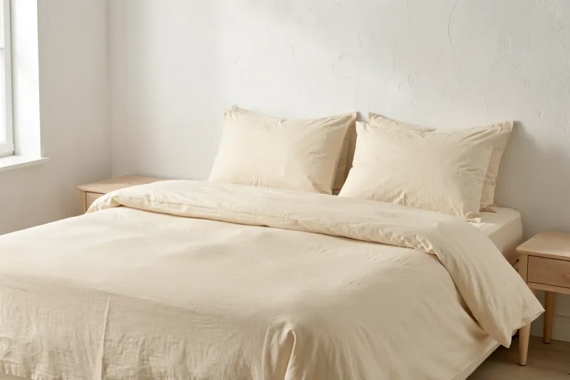
Applied to bedding: duvet in the base tone, sheets and shams in the secondary, one throw as the accent. That is the whole scheme.
Pick tones that are neighbours
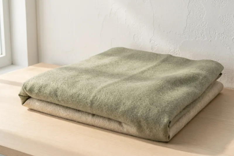
The safest palettes use colours next to each other on the wheel, at different lightnesses. Our own is exactly that — a dusty plum, a warm oat, a sand — three tones from the same warm half of the spectrum, none of them saturated.
What fails is two strong colours from opposite sides. A navy duvet and a mustard throw is a striking combination in a living room and an exhausting one in a bedroom.
Warm or cool, and then commit
The single most common error is mixing warm and cool neutrals. A grey-blue sheet against a cream duvet looks dirty rather than layered, because your eye reads the cream as yellowed.
Decide which family the room is in — warm (cream, oat, sand, terracotta, plum) or cool (grey, slate, blue-white, sage) — and keep everything in it. Within one family almost anything works.
Let texture carry the variety
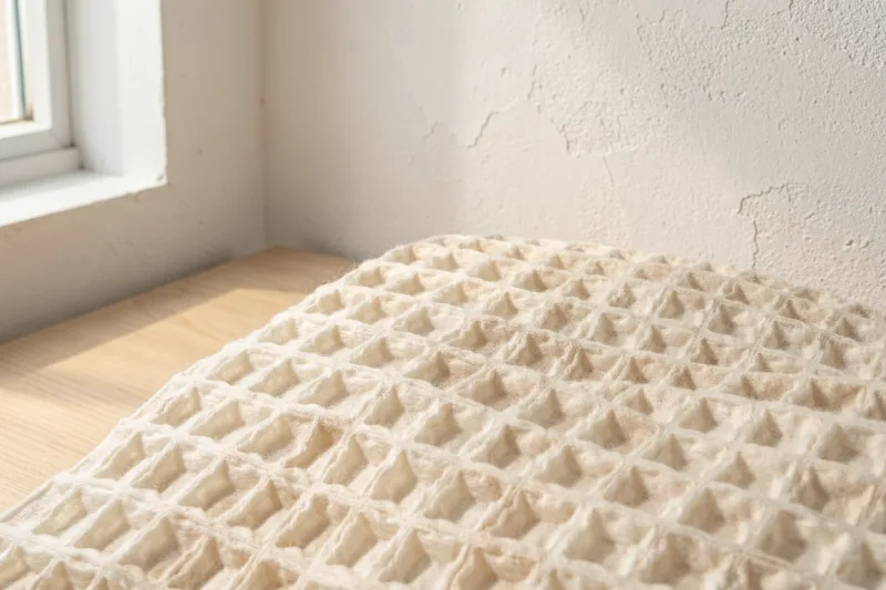
This is what makes a nearly monochrome bed interesting rather than flat. Three pieces in almost the same colour but different weaves — a matte linen duvet, a smooth sateen sheet, a deep waffle throw — give the eye somewhere to go without adding a single new hue.
It is also the more forgiving approach: textures never clash the way colours do.
Consider the light in your room
North-facing rooms get cool, blue-tinted light all day, which drains warm colours and can make grey look cold and hard. They generally want warmer bedding than you would choose in a shop.
South-facing rooms get warm light that intensifies warm tones — a terracotta that looked gentle under shop lighting can read orange by three in the afternoon.
Look at any sample in the actual room, at the time of day you use it.
The starting point if you are stuck
White or oat sheets, one mid-tone duvet in a colour you like, one textured throw a shade or two off the duvet. It is close to impossible to get wrong, and it leaves the room quiet enough to sleep in.